

Email Branding controls the overall appearance shared by your templates. A template can then add its own message-box styling and reusable styled sections where needed.
This guide explains the styling controls that live inside an individual email template.
For the logo, email container, global colors, footer, social icons, and global button appearance, see Email Branding & Global Styles.
Before you start #
Open WordPress Admin → Nelx JFB Email Templates → Form Templates, then open the template you want to style.
The template-level options covered here are:
- Custom Message Box Styling
- Section Styling
- button macros used inside Email Content
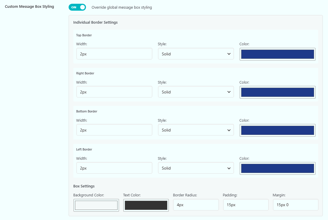
Custom Message Box Styling #
Email Branding can apply one message-box style globally.
If one template needs a different message-box appearance, turn on:
Override global message box styling
under Custom Message Box Styling.
When enabled, the template uses its own message-box settings instead of the global message-box settings.
What the message box affects #
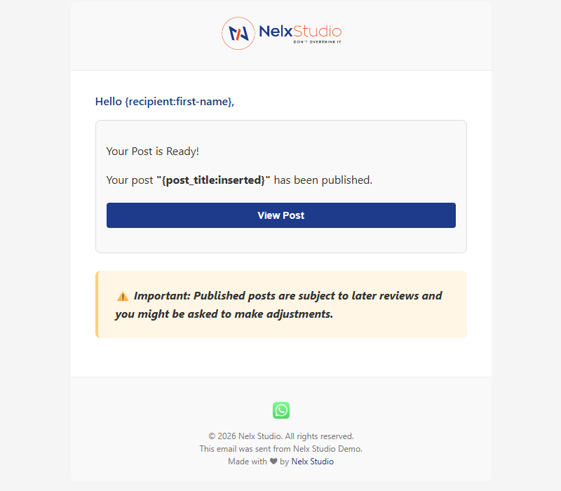
The message box wraps the template’s email content as a styled block.
You do not insert a separate message-box macro into the editor. Turning on the template override changes the message box used for that template.
If neither the template message box nor the global message box is enabled, the email content is rendered without that wrapper.
Message-box border settings #
Each side of the message box can be configured separately:
- Top
- Right
- Bottom
- Left
For each side you can set:
- Width
- Style
- Color
Available border styles include:
- Solid
- Dashed
- Dotted
- Double
- Groove
- Ridge
- Inset
- Outset
This is useful when you want, for example, a stronger left border while keeping the other sides lighter.
Message-box settings #
The template also provides:
| Setting | What it controls |
|---|---|
| Background Color | Background inside the message box |
| Text Color | Main text color inside the box |
| Border Radius | Corner rounding |
| Padding | Space between the content and the box edges |
| Margin | Space around the message box |
Use normal CSS-style values where the field expects a measurement, for example:
4px15px15px 0
When to use the global style instead #
If most or all emails should use the same message-box design, configure it once under Email Branding and leave the template override off.
Use Custom Message Box Styling only when this specific template needs to look different.
That keeps your email design easier to maintain.
Section Styling #
Section Styling lets you create one or more styled blocks inside the email content.
Unlike the message box, which wraps the main content, sections are placed exactly where you put their macros.
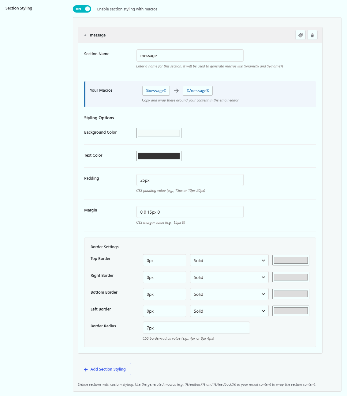
Turn on:
Enable section styling with macros
then click:
Add Section Styling
Create a section #
Each section has a name.
For example:
Important Notice
The plugin converts that name into a safe macro name, such as:
%important-notice%
and:
%/important-notice%
These are the opening and closing markers for that section.
You can copy the generated macros from the section controls.
Section styling options #
Each section can have its own:
- Background Color
- Padding
- Margin
- Top Border
- Right Border
- Bottom Border
- Left Border
- Border Radius
Each border side has its own width, style, and color.
This makes sections useful for content such as:
- notices;
- summaries;
- warnings;
- next steps;
- highlighted details;
- calls to action.
Use a section in Email Content #
Place the opening macro before the content and the closing macro after it.
Example:
%important-notice%

Please review the information below before continuing.

%/important-notice%
For cleaner editor output, keep the opening and closing macros on their own paragraphs.
You can place normal placeholders and button macros inside the section.
Example:
%request-summary%

Your request #{post_id:inserted} has been received.
[button:{post_url:inserted}]View Request[/button]
%/request-summary%
You can create more than one section #
A template can contain several section styles.
For example:
%summary% ... %/summary%%warning% ... %/warning%%next-steps% ... %/next-steps%
Each section keeps its own settings.
Only use names that make sense for the purpose of the content. This makes the template easier to maintain later.
Section styles belong to the template #
A section created in one template is not a global section library.
Its macros work with the section definitions saved on that template.
If another template needs the same visual block, create the corresponding section there as well or duplicate the template when that makes sense.
For template duplication, see Managing Email Templates.
Button macros #
Buttons are inserted into the email using:
[button:URL]Button Text[/button]
For example:
[button:https://example.com/dashboard/]Open Dashboard[/button]
You can also use a placeholder in the URL:
[button:{post_url:inserted}]View Request[/button]
The template editor includes a Button Macro quick-insert control where the macro is available.
Button appearance comes from Email Branding #
The button macro determines:
- where the button appears;
- its URL;
- its text.
Its visual styling comes from the global Email Branding button settings.
Those settings include:
- Button Color
- Button Text Color
- Button Hover Color
- Padding
- Border Radius
- Font Size
- Font Weight
- Border
- Margin
- responsive button positioning
If you need to change the button design, edit the branding settings rather than changing the macro syntax.
Responsive button positioning #
Email Branding can set button alignment separately for:
- Desktop
- Tablet
- Mobile
The available positions include:
- Left
- Center
- Right
- Justify
When Justify is used, the button stretches to the available width for that device setting.
The content of the button macro does not change.
Buttons inside styled sections #
A button can sit inside a styled section.
Example:
%next-steps%

Your application has been received.

[button:{site_url}/account/]Open Your Account[/button]

%/next-steps%
The section controls the surrounding block. The button keeps the global button styling from Email Branding.
Message box vs section styling #
They solve different problems.
| Feature | Use it for |
|---|---|
| Global Message Box | One consistent content wrapper across templates |
| Custom Message Box Styling | A different content wrapper for one template |
| Section Styling | Selected blocks inside a template |
| Button Macro | A styled link or call-to-action button |
You can use a custom message box, styled sections, and buttons in the same template.
A practical setup #
Suppose an application email needs:
- a normal branded email;
- a pale summary block;
- a warning block;
- a button to open the application.
You could:
- Keep the global email branding for the overall email.
- Leave the global message box in place, or override it if this template needs a different content wrapper.
- Create a section named Application Summary.
- Create another section named Important Notice.
- Insert the generated macros around the relevant content.
- Add a button macro for the application URL.
- Preview the email before saving the final design.
This keeps the template readable while avoiding large amounts of custom HTML.
If a section is not styled #
Check these points:
- Make sure Enable section styling with macros is turned on.
- Confirm that the section still exists in the template.
- Use the generated opening and closing macro names exactly.
- Make sure the opening and closing markers match.
- Keep the markers on their own paragraphs where possible.
- Save the template after changing the section settings.
- Preview the email to check the rendered result rather than judging only from the editor.
If a button is not rendering correctly #
Check that the macro follows this structure:
[button:URL]Text[/button]
Also check that:
- the URL resolves to a valid URL;
- the closing
[/button]tag is present; - placeholders used in the URL resolve to a usable value;
- the button’s appearance is configured under Email Branding.
Where to go next #
For all supported placeholder formats, see Dynamic Content, Placeholders & Macros.
For the global email design, see Email Branding & Global Styles.
For responsive repeater output, see Repeater Fields in Email Templates.


