This section configures confirmation and processing modals for your JetFormBuilder forms. You can set global defaults and override them for specific forms.
Accessing Form Submission Settings #
- Go to your WordPress admin panel.
- Navigate to Nelx JFB Email Templates in the left menu.
- Click on the “Form Submit” tab at the top.
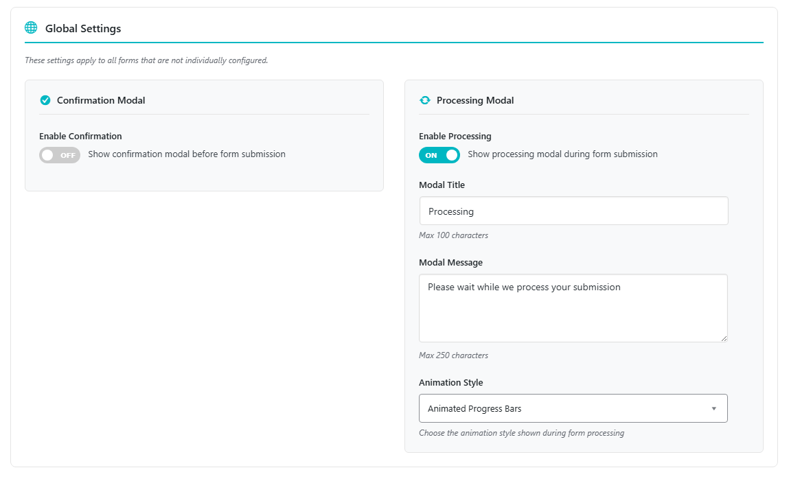
Global Settings #
These settings apply to all forms that are not individually configured.
Confirmation Modal #
Toggle on “Show confirmation modal before form submission” to enable.
| Setting | Description | Max Length |
|---|---|---|
| Modal Title | The heading of the confirmation dialog | 100 characters |
| Modal Message | The message asking for confirmation | 250 characters |
| Confirm Button Text | Text on the submit button | 50 characters |
| Cancel Button Text | Text on the cancel button | 50 characters |
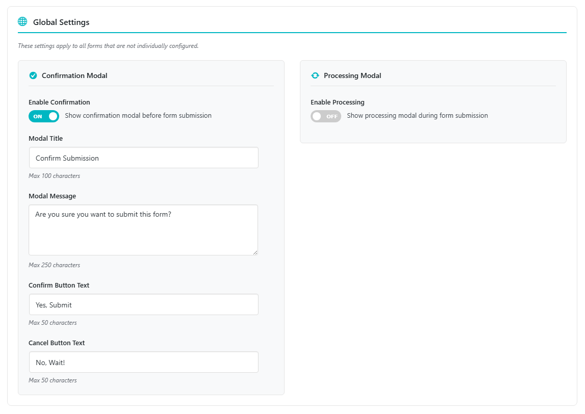
How it works: When enabled, users see a confirmation dialog before the form submits. If they click Cancel, the submission is aborted.
Processing Modal #
Toggle on “Show processing modal during form submission” to enable.
| Setting | Description | Max Length |
|---|---|---|
| Modal Title | The heading of the processing dialog | 100 characters |
| Modal Message | The message shown while processing | 250 characters |
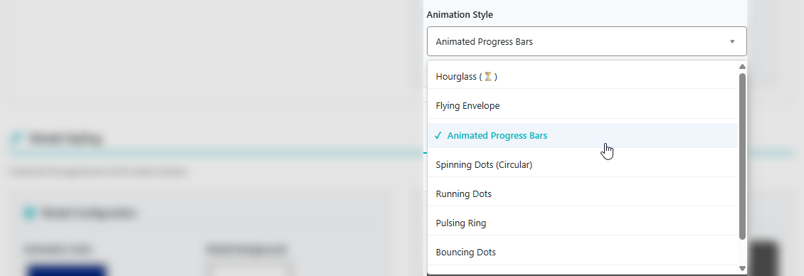
| Animation Style | Choose the animation displayed | See options below |
Animation Styles Available:
| Style | Description |
|---|---|
| Spinning Icon (Hourglass) | Classic rotating hourglass animation |
| Flying Envelope | An envelope that flies across the screen |
| Animated Progress Bars | Vertical bars that bounce up and down |
| Spinning Dots (Circular) | Dots rotating in a circle |
| Running Dots | Dots that run horizontally across the screen |
| Pulsing Ring | Expanding and fading ring pulses |
| Bouncing Dots | Three dots bouncing vertically |
| Wave Sound Bars | Audio visualizer-style bars |
Note: If the Nelx Secure Docs plugin has its own processing modal enabled, you must disable it first before enabling this modal.
Modal Styling #
Customize the appearance of all modal windows (both confirmation and processing).
Configuration Options #
| Setting | What it affects | Default |
|---|---|---|
| Animation Color | Color of animations (dots, bars, rings, hourglass) | #00B7C2 |
| Modal Background | Background color of the modal content area | #ffffff |
| Confirm Button Color | Background color of the confirm/submit button | #00B7C2 |
| Confirm Button Hover | Background color on hover for confirm button | #0097a0 |
| Confirm Text Color | Text color of the confirm button | #ffffff |
| Cancel Button Color | Background color of the cancel button | #f1f1f1 |
| Cancel Button Hover | Background color on hover for cancel button | #e5e5e5 |
| Cancel Text Color | Text color of the cancel button | #333333 |
| Title Color | Color of the modal title text | #1d2327 |
| Message Color | Color of the modal message text | #374151 |
| Border Radius | Corner rounding of the modal (px) | 16px |
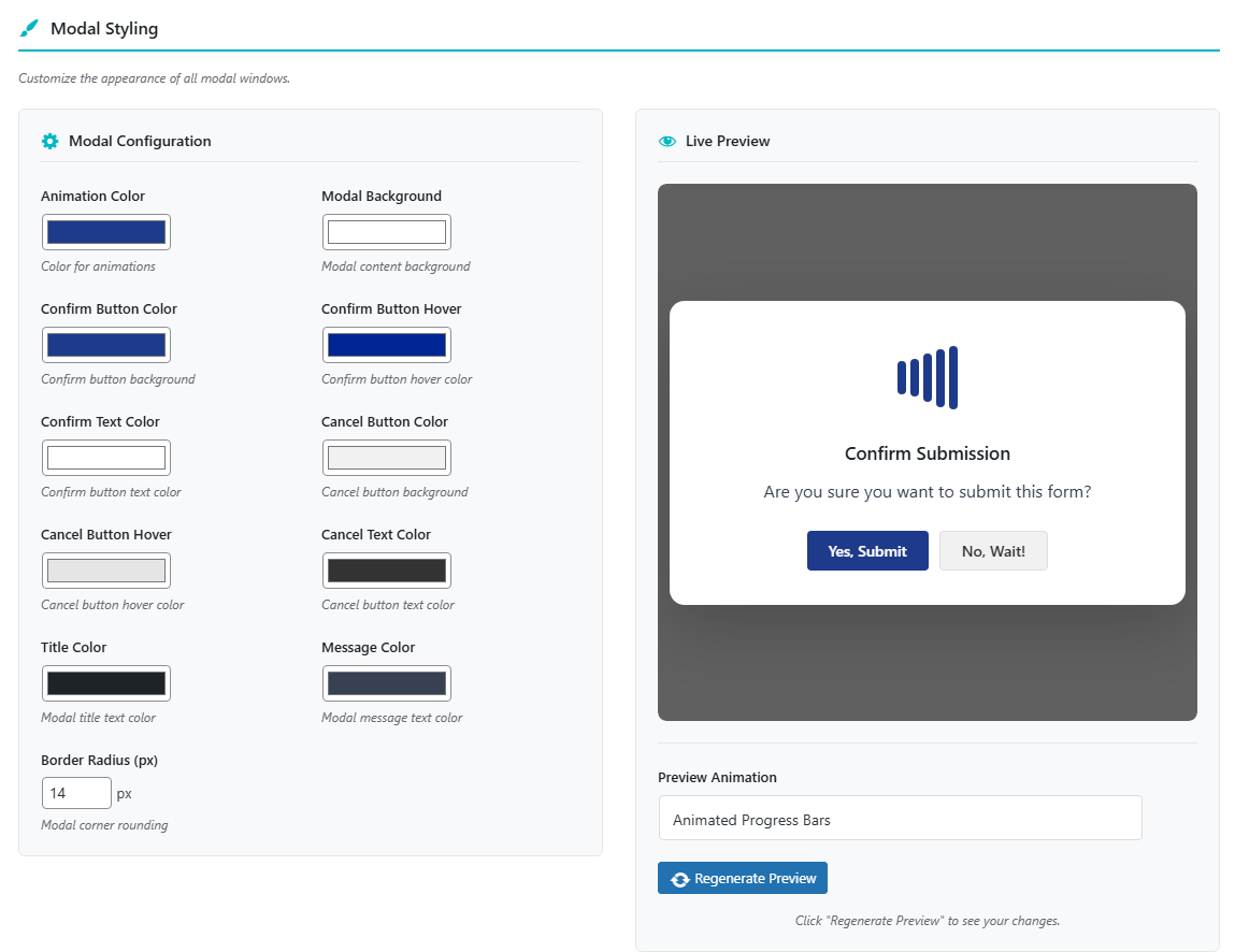
Live Preview #
The settings page includes a live preview that updates when you click “Regenerate Preview”. You can also select different animation styles to preview how they will look.
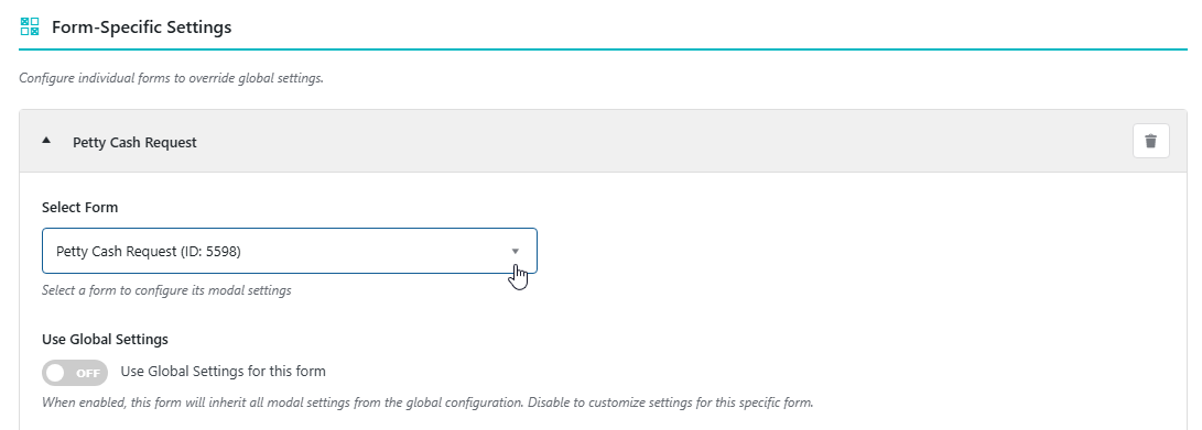
Form-Specific Settings #
Override global settings for individual forms.
How to Configure a Form #
- Click “Configure New Form”.
- Select a form from the dropdown.
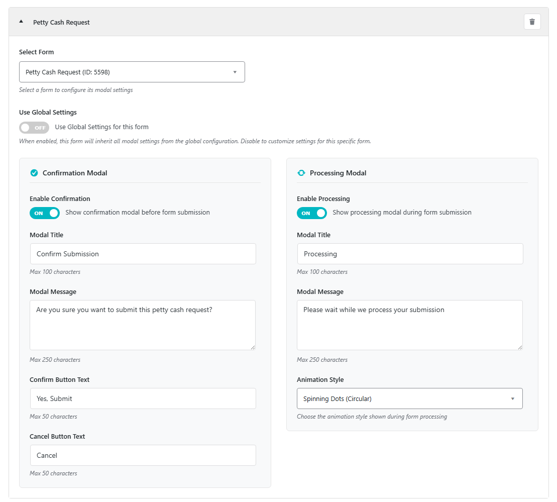
- By default, “Use Global Settings” is checked. Uncheck to customize.
- Configure the Confirmation and Processing modals as desired.
- Settings are automatically saved.
Form Configuration Options #
When “Use Global Settings” is unchecked, you can set:
Confirmation Modal (per form)
- Enable/disable
- Custom title, message, confirm text, cancel text
Processing Modal (per form)
- Enable/disable
- Custom title, message, animation style
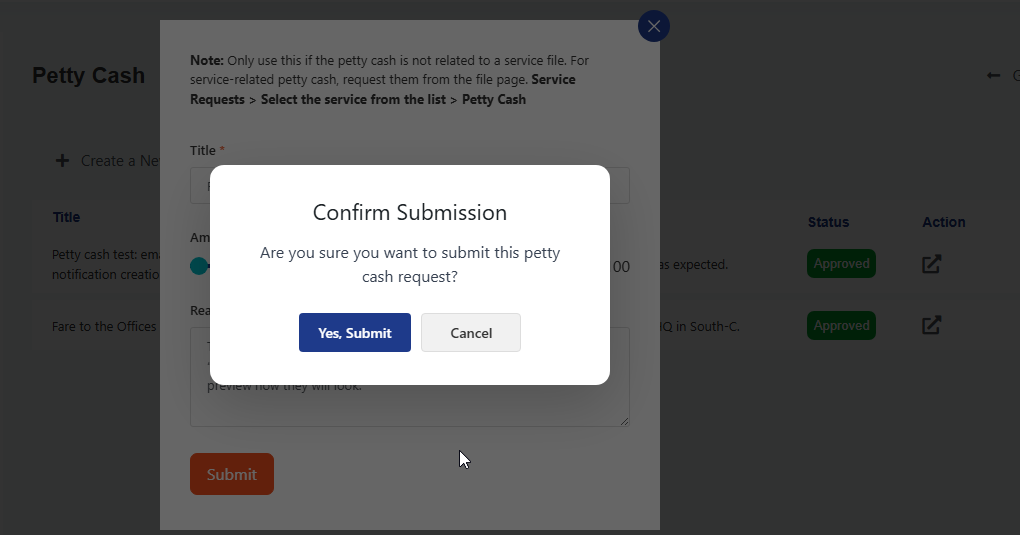
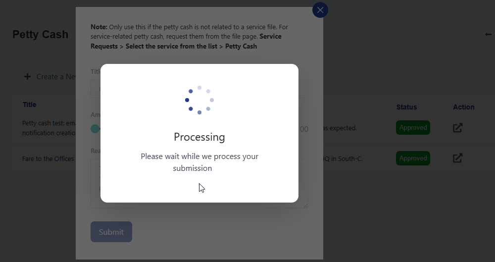
Note: Form-specific settings override global settings. If both modals are enabled, the confirmation modal appears first, followed by the processing modal after confirmation. If only processing is enabled, it shows immediately on form submission.
Below are sample frontend screenshots
Confirmation Modal
Processing Modal
Important Note: If your JetFormBuilder form is inside a popup modal such as JetPopup or Elementor popup, make sure to disable close on overlay to prevent the form popup modal from disappearing when our modals are triggered.


