This guide walks you through the Email Branding settings that apply to all emails sent through the plugin. These global settings create a consistent look across all your email templates.
Accessing Email Branding #
- Go to your WordPress admin panel.
- Navigate to Nelx JFB Email Templates in the left menu.
- Click on the “Email Branding” tab at the top.
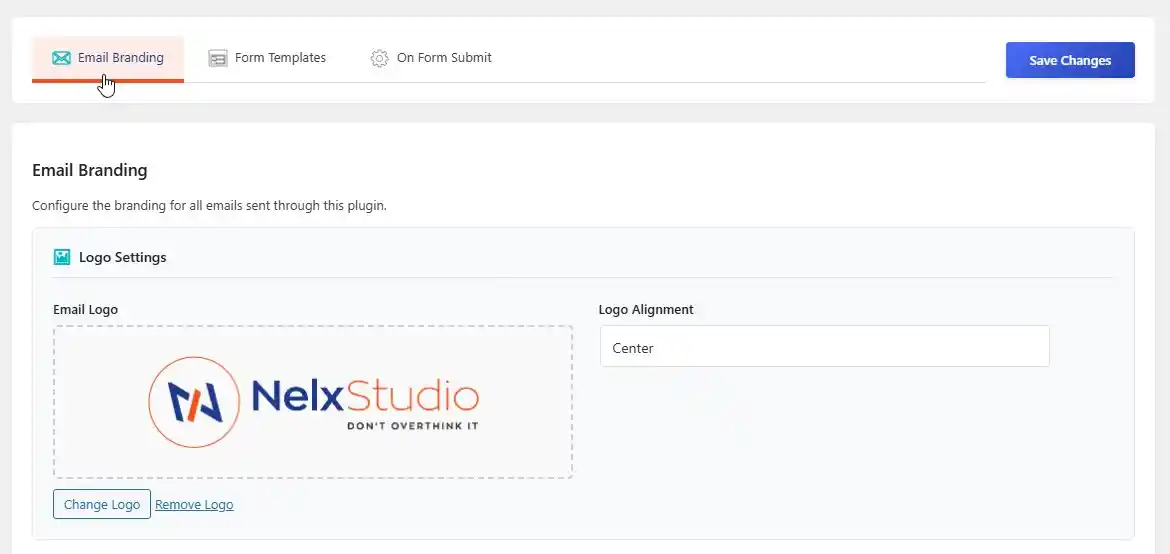
Step 1: Email Logo #
- Drag and drop an image into the upload area, or click Select Image to choose from your media library.
- Recommended size: 180×60 pixels.
- Format: Transparent PNG for best results.
- Choose logo alignment: Left, Center, or Right.
Fallback Behavior #
- If no custom logo is uploaded, the plugin tries to use your site logo.
- If no site logo exists, it displays your site name as text.
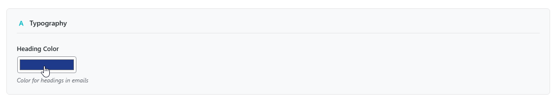
Heading Color #
- Choose the color for all headings (H1, H2, H3).
- This applies to all email templates.
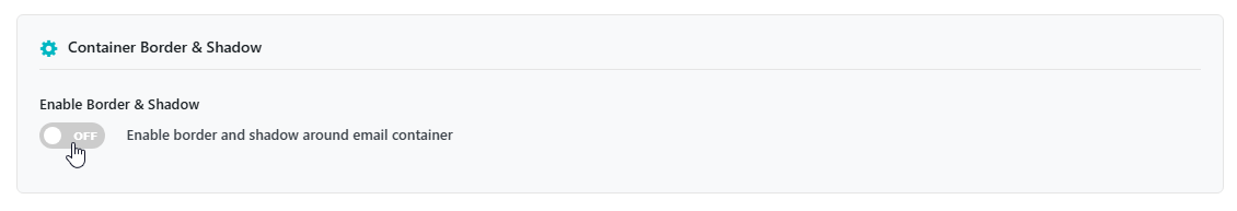
Step 2: Email Container Border & Shadow #
Toggle “Enable Border & Shadow” to show/hide the email container frame.
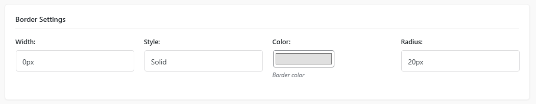
Border Settings #
| Setting | What it does | Options |
|---|---|---|
| Width | How thick the border is | 0px to 5px |
| Style | Border appearance | Solid, Dashed, Dotted, Double |
| Color | Border color | Pick any color |
| Radius | How rounded the corners are | 0px to 25px |
Box Shadow Settings #
| Setting | What it does | Options |
|---|---|---|
| Horizontal Offset | Shadow position left/right | 0px to 5px |
| Vertical Offset | Shadow position up/down | 0px to 5px |
| Blur Radius | How soft the shadow edges are | 0px to 20px |
| Spread | How far the shadow extends | 0px to 4px |
| Shadow Color & Opacity | Color and transparency of the shadow | Pick color + opacity slider (0-1) |
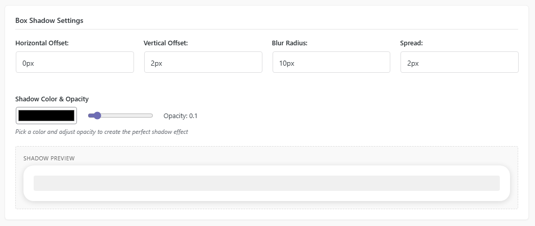
A live preview of the container border and shadow is shown below the settings.
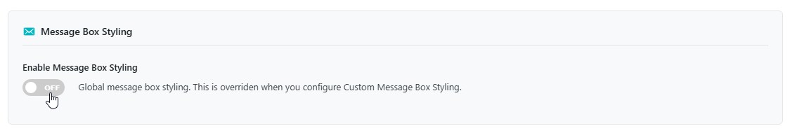
Step 3: Message Box Styling (Global) #
Toggle “Enable Message Box Styling” to apply these styles globally. (These are overridden when you configure Custom Message Box Styling in a template.)
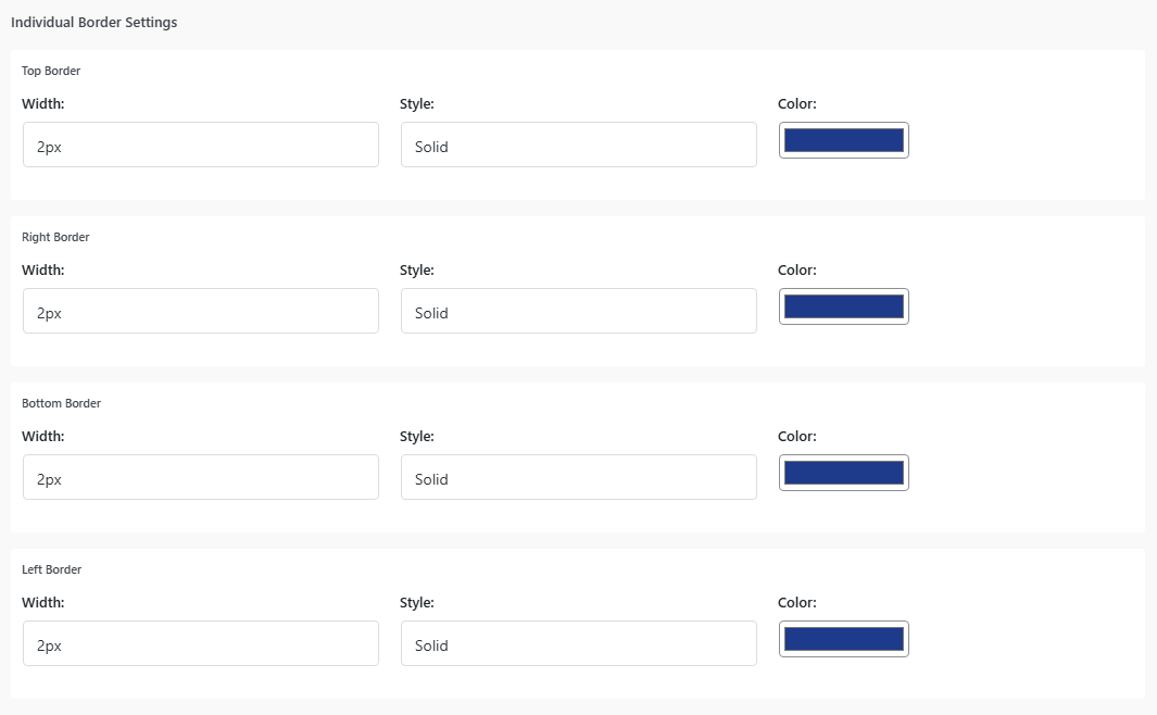
Individual Border Settings (per side) #
| Setting | What it does | Options |
|---|---|---|
| Width (Top/Right/Bottom/Left) | Thickness for each side | 0px to 5px |
| Style (per side) | Border appearance per side | Solid, Dashed, Dotted, Double, Groove, Ridge, Inset, Outset |
| Color (per side) | Color for each border side | Pick any color |
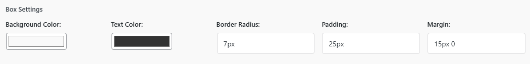
Box Settings #
| Setting | What it does | Example |
|---|---|---|
| Background Color | Color inside the message box | #f9f9f9 |
| Text Color | Color of text inside the box | #333333 |
| Border Radius | Rounded corners | 4px |
| Padding | Space inside the box | 15px |
| Margin | Space outside the box | 15px 0 |
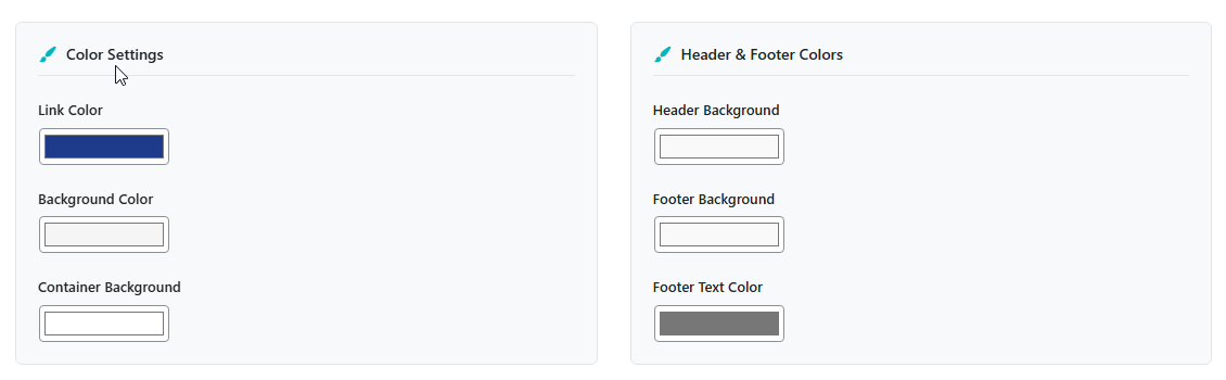
Step 4: Color Settings #
| Setting | What it affects |
|---|---|
| Link Color | Color for links in email |
| Background Color | Overall email background |
| Container Background | Main email content area |
| Header Background | Email header (behind logo) |
| Footer Background | Email footer |
| Footer Text Color | Text in the footer |
Step 5: Button Settings #
| Setting | What it does | Example |
|---|---|---|
| Button Color | Background color of the button | #1e3a8a |
| Button Text Color | Color of button text | #ffffff |
| Button Hover Color | Background color on hover | #f4511e |
Responsive Button Positioning #
| Device | Screen size | Options |
|---|---|---|
| Desktop | > 1024px | Left, Center, Right, Justify (Full Width) |
| Tablet | 768px – 1024px | Left, Center, Right, Justify |
| Mobile | < 768px | Left, Center, Right, Justify |
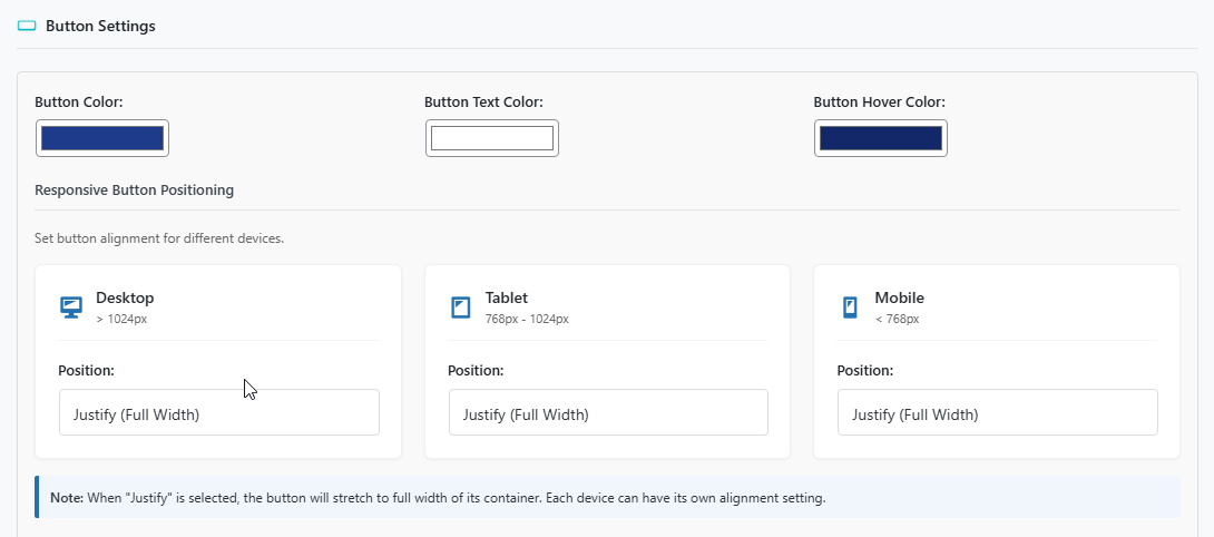
Note: When “Justify” is selected, the button stretches to full width of its container. Each device can have its own alignment setting.
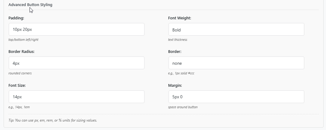
Advanced Button Styling #
| Setting | What it does | Example |
|---|---|---|
| Padding | Space inside the button | 10px 20px |
| Border Radius | Rounded corners | 4px |
| Font Size | Size of button text | 14px |
| Font Weight | Text thickness | Normal, Bold, 100-900 |
| Border | Border around the button | none or 1px solid #ccc |
| Margin | Space around the button | 5px 0 |
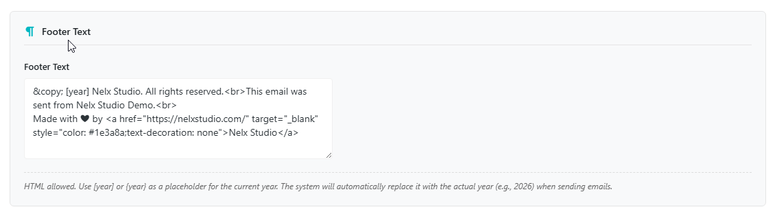
Step 6: Footer Text #
- You can edit the default footer text.
- You can include HTML such as
<br>for line breaks. - Use
[year]or{year}as a placeholder for the current year (automatically replaced). - Add company address or unsubscribe text if needed.
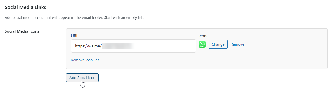
Step 7: Social Media Links #
- Click “Add Social Icon”.
- Add the profile URL.
- Upload a small icon image.
- Recommended icon size: 24×24 pixels.
- Use consistent icon style across platforms.
Quick Reference: Branding Settings Summary #
| Section | What it affects | Template-specific override? |
|---|---|---|
| Email Logo | Header of all emails | No |
| Container Border & Shadow | Frame around email | No |
| Message Box Styling | Message boxes in all emails | Yes (per template) |
| Heading Color | All headings | No |
| Button Settings | All buttons | No |
| Link Color | All text links | No |
| Background Colors | Various email sections | No |
| Footer Text | Email footer | No |
| Social Icons | Footer icons | No |
Pro Tips for Great-Looking Emails #
- Keep it simple — stick to 2–3 brand colors.
- Use consistent spacing for a cleaner look.
- Test on mobile so buttons stay easy to tap.
- Keep logos readable at small sizes (180×60px).
- Include copyright, company name, and unsubscribe text where needed.
- Use the live preview to test button responsiveness across devices.
- Match the animation color in modals to your brand color for consistency.


