

Email Branding controls the shared appearance of emails sent through Nelx JFB Email Templates.
Set these options once when you want your templates to use the same logo, colors, message box, buttons, footer, and social links.
Individual templates can still override the global message box when a particular email needs a different treatment.
Open Email Branding #
Go to:
WordPress Admin → Nelx JFB Email Templates → Email Branding
Make your changes, then click Save Changes at the top of the plugin settings.
For a full email preview, open the relevant template under Form Templates and use its Preview action.
Logo Settings #
Email Logo #
Under Logo Settings, choose the image that should appear in the email header.
You can:
- drag an image into the upload area;
- click Select Image;
- replace the current image;
- remove the current image.
The recommended logo size shown in the settings is:
180 × 60px transparent PNG
The email renders the logo at up to 180px wide while allowing it to scale down on smaller screens.
Logo Alignment #
Choose:
- Left
- Center
- Right
The alignment applies to the logo in the email header.

Heading Color #
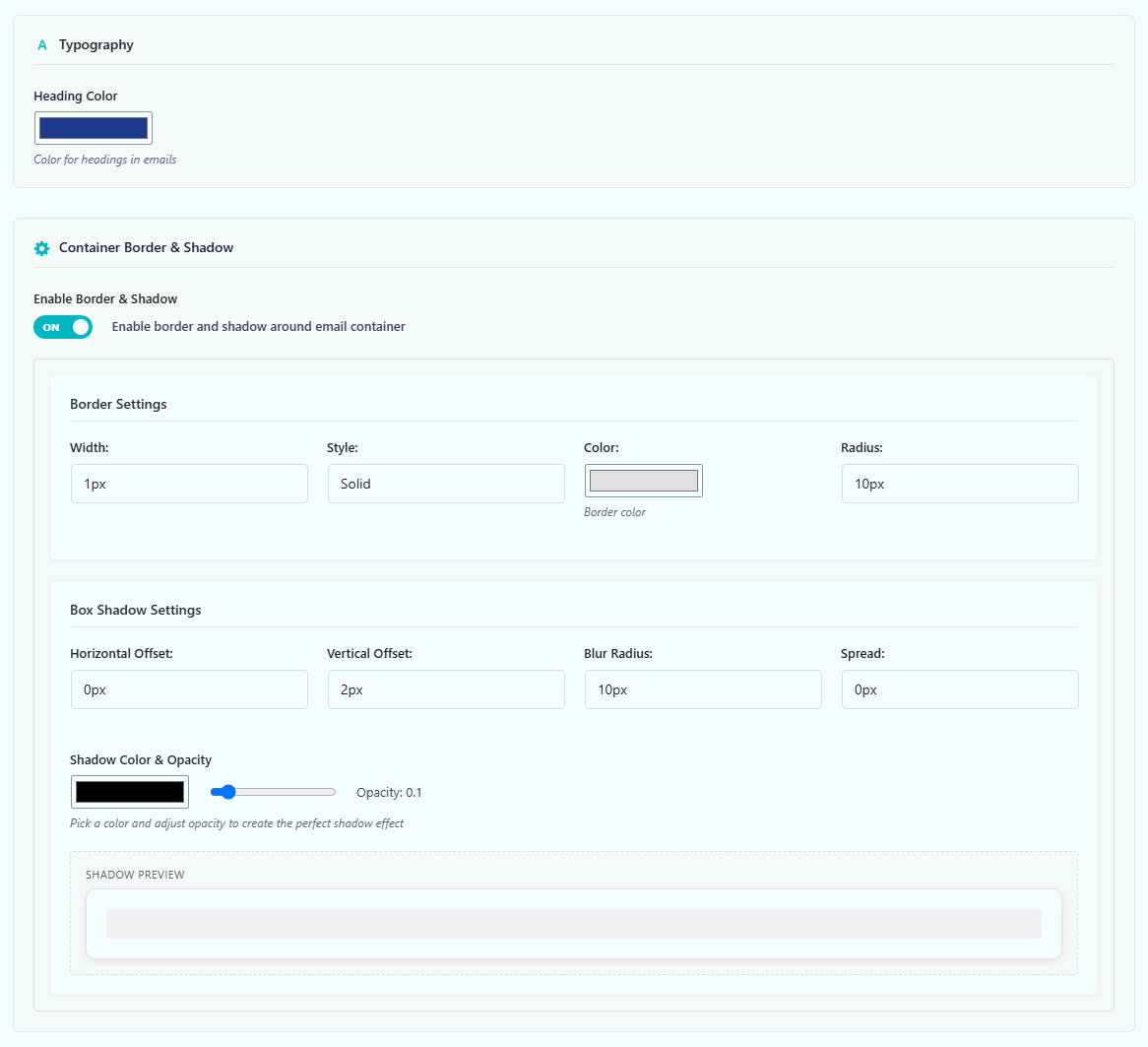
Under Typography, use Heading Color to set the color used by headings in the email body.
This applies to heading elements such as H1, H2, and H3 created in your email content.
Normal paragraph text is handled separately by the email layout and any message-box or section styling you have configured.
Container Border & Shadow #
The email content sits inside a central container.
Turn on:
Enable Border & Shadow
to use the container border and shadow settings.
Border Settings #
You can set:
- Width
- Style
- Color
- Border Radius
Available border styles include:
- Solid
- Dashed
- Dotted
- Double
Use a width of 0px if you do not want a visible border.
Box Shadow Settings #
The shadow controls include:
- Horizontal Offset
- Vertical Offset
- Blur Radius
- Spread
- Shadow Color & Opacity
A Shadow Preview is shown in the settings area so you can check the effect while adjusting these values.
Keep email shadows subtle. Some email clients handle advanced CSS differently, so the main content should still look clear without relying on the shadow.
Global Message Box Styling #
Turn on:
Enable Message Box Styling
when you want the email content to sit inside a styled message box.
This is a global setting. It applies to templates unless a template has Custom Message Box Styling enabled.
Border Controls #
Each side can be configured separately:
- Top
- Right
- Bottom
- Left
For each side, choose:
- width;
- style;
- color.
Available styles include:
- Solid
- Dashed
- Dotted
- Double
- Groove
- Ridge
- Inset
- Outset
Box Controls #
You can also set:
- Background Color
- Text Color
- Border Radius
- Padding
- Margin
Use the global message box when most of your templates should share the same content treatment.

If one template needs something different, leave the global settings in place and use that template’s Custom Message Box Styling instead.
See Template Styling: Message Boxes, Sections & Buttons for the template-level override.
Email Colors #
The global color settings include:
| Setting | What it controls |
|---|---|
| Link Color | Normal links inside the email |
| Background Color | Outer email background |
| Container Background | Main email container |
| Header Background | Header area |
| Footer Background | Footer area |
| Footer Text Color | Footer text and the View in Browser link |
These settings apply across the emails generated by the plugin.
Button Settings #
The button settings control buttons created with the email button macro.
For example:
[button:{post_url:inserted}]View Request[/button]
The macro decides where the button appears and where it links. Email Branding controls how the button looks.
For button syntax, see Dynamic Content, Placeholders & Macros.
Button Colors #
You can set:
- Button Color
- Button Text Color
- Button Hover Color
Responsive Button Positioning #
Button position can be set separately for:
- Desktop
- Tablet
- Mobile
Each device can use:
- Left
- Center
- Right
- Justify (Full Width)
The current email layout uses:
- Desktop as the normal/base position;
- Tablet from 769px to 1024px;
- Mobile at 768px and below.
When Justify is selected, the button uses the available width for that device range.
Advanced Button Styling #
You can also set:
- Padding
- Border Radius
- Font Size
- Font Weight
- Border
- Margin
The sizing fields accept normal CSS units such as:
pxemrem%
For example:
10px 20pxfor padding, or:
1px solid #ccccccfor a border.

Footer Text #
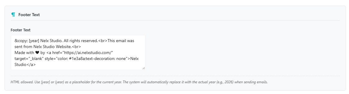
Use Footer Text to set the content shown at the bottom of your emails.
HTML is allowed.
You can use either of these placeholders for the current year:
[year]{year}
For example:
© [year] Example Company. All rights reserved.The year is replaced when the email is generated.
Social Media Links #
The Social Media Links section lets you add linked icons to the email footer.
Click:
Add Social Icon
For each item:
- Enter the profile or destination URL.
- Select the icon image.
- Save your changes.
The email renders social icons at 24 × 24px, so use clear square icons that remain readable at that size.
You can add more than one social link and remove any icon set you no longer need.

Global Branding vs Template Styling #
Use this rule when deciding where to make a change:
| You want to change… | Use… |
|---|---|
| Logo, email colors, container, footer, social icons | Email Branding |
| Button appearance across templates | Email Branding |
| Message box across templates | Email Branding |
| Message box for one template only | Custom Message Box Styling in that template |
| A styled block inside one template | Section Styling in that template |
| Where a button appears in the content | Button macro in the template |
This keeps the shared design in one place and prevents the same styles from being repeated across every template.
A Simple Branding Setup #
If you are setting up the plugin for the first time, a practical order is:
- Add the email logo.
- Set the heading and link colors.
- Set the outer and container backgrounds.
- Decide whether you want a container border and shadow.
- Configure the global message box if you plan to use one.
- Style the buttons.
- Add the footer text.
- Add social icons if needed.
- Click Save Changes.
- Open one of your templates and use Preview to check the complete email.
You can return and refine the branding later without rebuilding your templates.
If Your Branding Changes Are Not Showing #
Check these points:
- Make sure you clicked Save Changes.
- Preview the template again after saving.
- If the message box is different from the global settings, check whether that template has Custom Message Box Styling enabled.
- If a button’s position or appearance is unexpected, check the relevant Desktop, Tablet, and Mobile button settings.
- If a logo is not showing, make sure an Email Logo is actually selected and saved.
Where to Go Next #
For per-template message boxes and styled sections, see Template Styling: Message Boxes, Sections & Buttons.
For button and placeholder syntax, see Dynamic Content, Placeholders & Macros.
For the browser copy link shown in the email header, see View in Browser.


