

Modern Form Fields gives standard JetFormBuilder fields a consistent frontend appearance without changing how JetFormBuilder validates or submits them.
It is independent from Modern Media Upload. You can use either feature on its own or enable both.
Open the Settings #
Go to:
WordPress Admin → Nelx JFB Email Templates → Media Upload
The page contains the Media & Form UI settings.
Turn on:
Enable Modern Form Fields
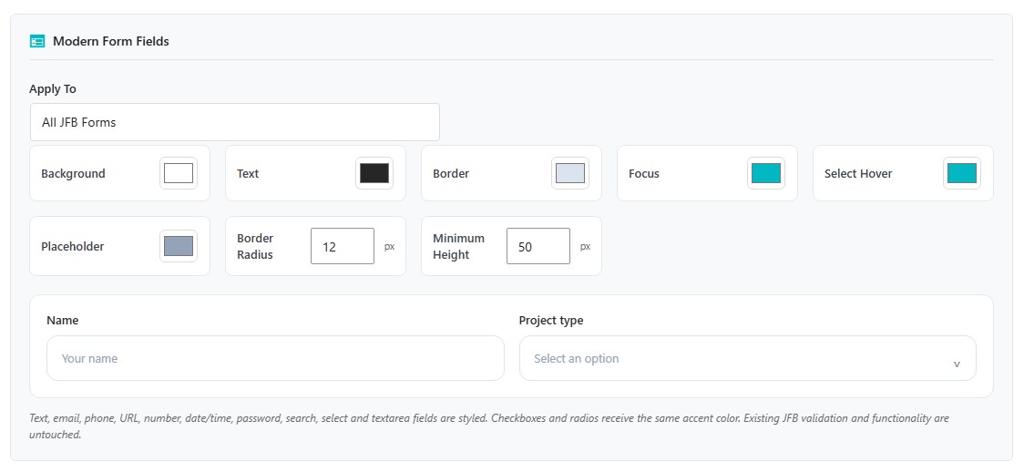
The Modern Form Fields settings appear below the switch.
What Modern Form Fields Changes #
The feature styles these field types:
- Text
- Phone
- URL
- Number
- Date
- Time
- Date and time
- Password
- Search
- Select
- Textarea
Checkboxes and radio buttons receive the same focus/accent color used by the modern field styling.
The feature does not replace JetFormBuilder’s field validation, conditions, required-field rules, or submitted values.
Choose Where It Applies #
Under Apply To, choose:
- All JFB Forms
- Only Forms inside CSS Class
All JFB Forms #
The modern field styling is applied to JetFormBuilder forms across the site.
Only Forms inside CSS Class #
Use this when only selected forms should use the modern field treatment.
Enter a class in Target CSS Class without the leading dot.
For example:
modern-formThe class can be on the JetFormBuilder form itself or on a parent container around the form.
This makes it possible to apply the styling to a group of forms without editing every individual field.
Appearance Settings #
Modern Form Fields provides the following controls:
| Setting | What it changes |
|---|---|
| Background | Field background |
| Text | Entered field value |
| Border | Normal field border |
| Focus | Border and focus accent when the field is active |
| Select Hover | Hover accent used in the enhanced Select dropdown |
| Placeholder | Placeholder text |
| Border Radius | Corner rounding |
| Minimum Height | Minimum height of the supported controls |
The settings page includes a small preview for a text field and a select field.
Text Inputs and Textareas #
Supported text-style controls receive the configured:
- background;
- text color;
- border;
- focus state;
- placeholder color;
- border radius;
- minimum height.
Textareas keep a larger starting height and remain resizable vertically.
Disabled fields remain visibly disabled.
Select Fields #
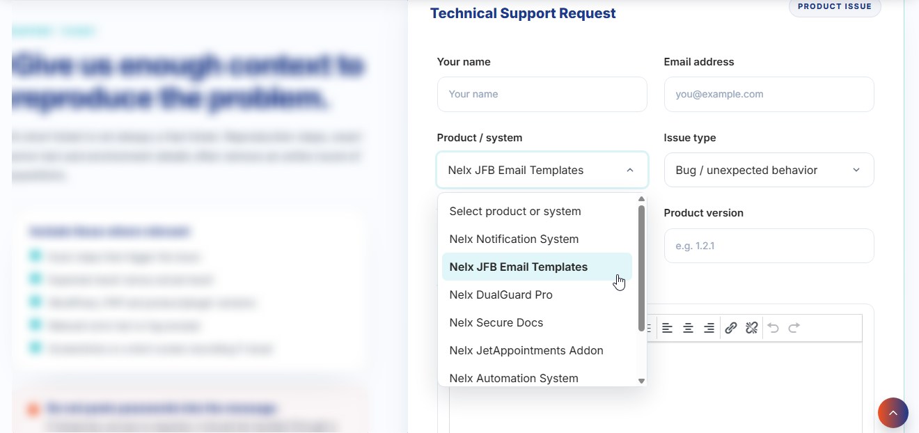
Single-choice JetFormBuilder Select Fields receive an enhanced dropdown interface.
The modern dropdown provides:
- a styled trigger;
- a scrollable option list;
- selected-option highlighting;
- configurable option hover color;
- automatic opening above the field when there is not enough room below.
The dropdown closes when the user makes a selection, clicks elsewhere, presses Escape, or scrolls the surrounding page.
Scrolling inside a long option list does not close the dropdown.
JetFormBuilder Still Owns the Select Value #
The enhanced Select is a visual layer around the original JetFormBuilder Select Field.
The original select remains in the form and remains the value JetFormBuilder submits.
When the user chooses an item in the modern dropdown, the original field is updated and its normal input and change events are triggered.
This is important because existing JetFormBuilder behavior can continue using the same field value.
Select Fields in Repeaters #
The enhanced Select also works for Select Fields added inside new repeater rows after the page has loaded.
You do not need a separate setting for repeater selects.
Multiple Select Fields #
A Select Field configured for multiple selections is left as the native select rather than being converted to the custom single-select dropdown.
The general field styling can still apply, but the custom dropdown interface is only used for single-choice selects.
Checkboxes and Radio Buttons #
Checkboxes and radio buttons are not converted into a new custom control.
They keep their normal form behavior and receive the configured focus/accent color.
This keeps the field simple while matching the rest of the form more closely.
Modern Form Fields and JetFormBuilder Validation #
Modern Form Fields does not change:
- whether a field is required;
- the type of value the field accepts;
- conditional visibility;
- the field name;
- the submitted value;
- the form actions that run after submission.
Configure those behaviors in JetFormBuilder as normal.
Use Nelx JFB Email Templates here only for the frontend field presentation.
Using Modern Form Fields With Modern Media Upload #
The two switches are separate.
A common setup is:
- Enable Modern Media Upload for Media Fields.
- Enable Modern Form Fields for the rest of the form.
- Use the same form or CSS-class scope for both when you want them applied together.
However, they do not need to share the same scope.
For example, you can modernize Media Fields site-wide while limiting Modern Form Fields to forms inside:
modern-formIf the Styling Does Not Appear #
Check these points:
- Make sure Enable Modern Form Fields is on.
- If you selected Only Forms inside CSS Class, check the class name carefully.
- Enter the class without a leading dot.
- Make sure the class is on the JetFormBuilder form or one of its parent containers.
- Save the settings and reload the frontend page.
- Confirm that the field type is one of the supported field types listed above.
If a Select Looks Different From Other Fields #
Check whether the field is configured for multiple selections.
The enhanced dropdown is intentionally used for single-choice Select Fields only.
Also confirm that the Select Field is inside a form covered by the current Apply To setting.
If a Select Option List Is Long #
The option list can scroll independently.
Keep the pointer over the dropdown and scroll the list normally. The menu is designed to remain open while its own options are being scrolled.
Where to Go Next #
For the upload field experience, see Modern Media Upload.
For adding uploaded files to email messages, see File Attachments & Secure Documents.
For creating the email itself, see Creating Your First Email Template.


