The plugin includes several Elementor widgets for displaying notification features on your frontend.
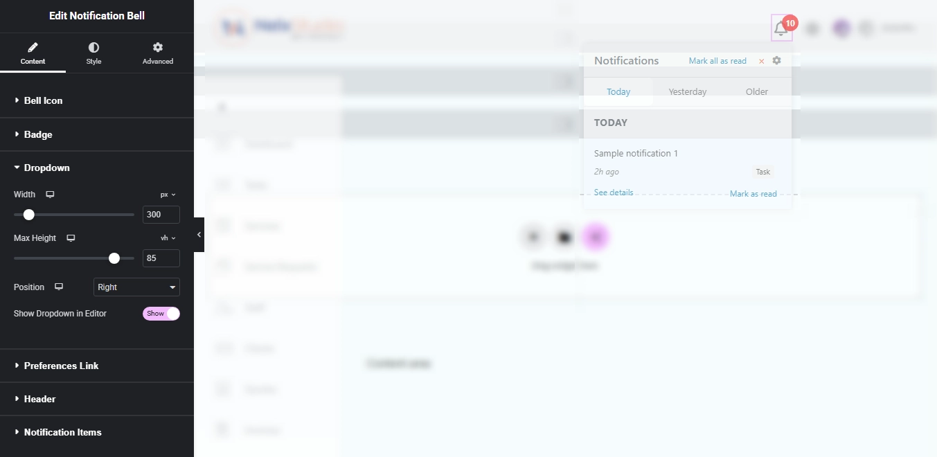
Notification Bell Widget #
The notification bell is the main way users see and interact with their notifications.
Content Settings #
Bell Icon
- Choose any icon from the Elementor icon library
- Set the icon size
- Pick the icon color and hover color
Badge
- Choose badge position: Top Right, Top Left, Bottom Right, Bottom Left
- Set badge text color and background color
- Badge automatically hides when there are no notifications
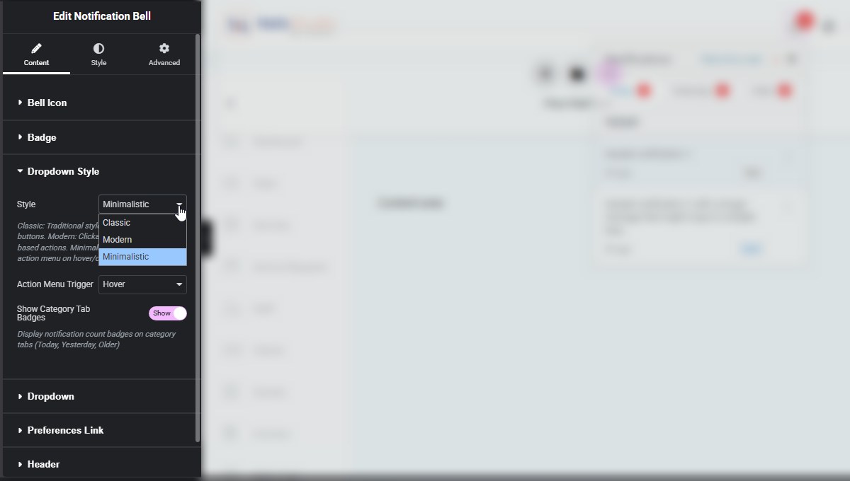
Dropdown Style
- Classic: Traditional style with separate action buttons.
- Modern: Clickable messages with icon-based actions.
- Minimalistic: Minimal UI with action menu on hover/click.
Dropdown
- Set dropdown width and max height
- Choose dropdown position (Left, Center, Right)
- Show dropdown in editor for easier design
Preferences Link
- Add an icon that links to your notification settings page
- Set the link URL
- Customize the icon
Header
- Set the dropdown title (default: “Notifications”)
- Show/hide the “Mark All” button
- Customize button text
- Show/hide the close button
Notification Items
- Show/hide “Mark as Read” buttons
- Customize button text
- Show/hide “See details” links
- Customize link text
Style Settings #
The style tab lets you customize every aspect of the notification bell:
- Category Badge — Background color, text color, size, typography
- Modern Item Style — Item hover background, checkmark color
- Minimalistic Menu Style — Menu container (background color, border color, border width, border radius, box shadow, menu width, menu padding), Menu Items (typography, item padding, divider color, divider width), View link/see details (normal/hover: text color, background color), Mark read button (normal/hover: text color, background color), Action Dots Icon (dots color, dots hover color, dots size)
- Bell Icon — Padding, margin, hover colors
- Badge — Size, typography, border, border radius, box shadow
- Dropdown — Background, border, border radius, box shadow, padding, margin
- Preferences Link — Colors, size, rotation, hover effects
- Header — Background, typography, text color, padding, border
- Mark All Button — Typography, colors, border, padding, margin
- Close Button — Size, color, hover color, margin
- Category Tabs — Text colors, background colors, border colors, padding, margin
- Notification Items — Typography, text color, background colors, border, padding, margin
- Notification Type — Background color, typography, text color, padding, border, border radius, margin
- View Link — Typography, colors, margin
- Mark Read Button — Typography, colors, border, padding, margin
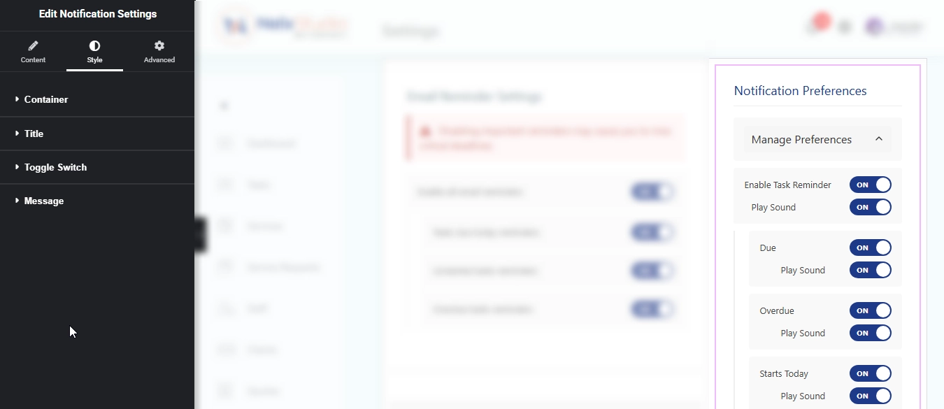
Notification Preference Settings Widget #
This widget lets users manage their notification preferences on the frontend.
How It Works #
- Users see a “Manage Preferences” toggle
- When expanded, they see all preference groups applicable to their role
- Each group has:
- Main enable/disable toggle
- Sound toggle
- Subtype toggles (if configured)
User Experience #
- Users can enable/disable entire notification types
- They can control whether each type plays a sound
- They can enable/disable specific subtypes
- Settings save automatically when changed
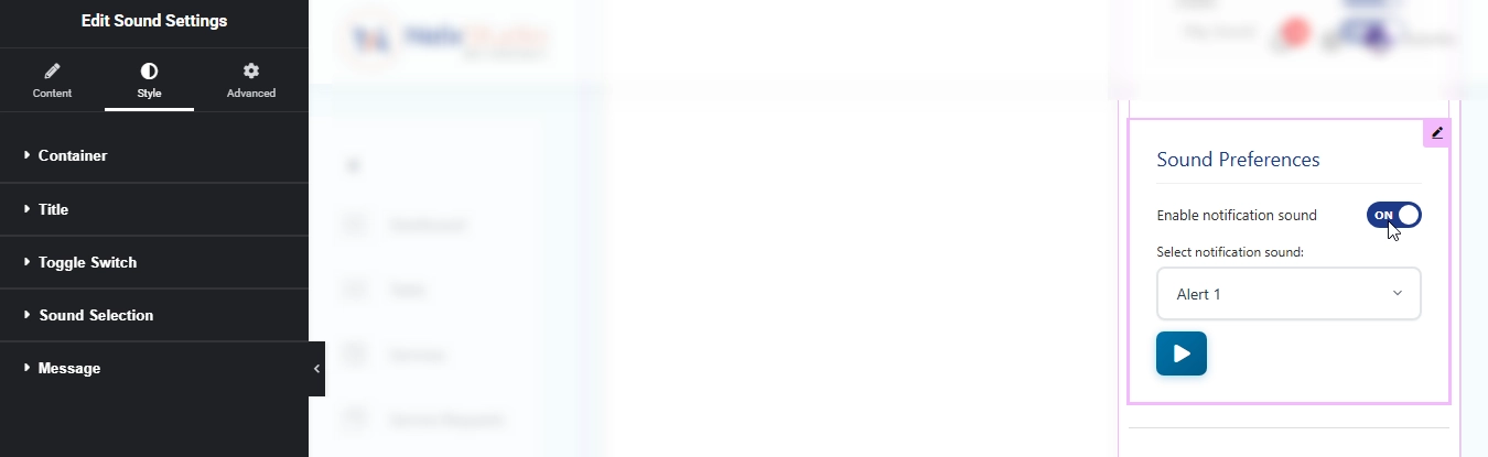
Sound Settings Widget #
This widget lets users customize their notification sounds.
Features #
- Enable/Disable Sounds — Master toggle for all notification sounds
- Sound Selection — Choose from available sounds (default or custom)
- Play Preview — Click the play button to hear what a sound sounds like
How It Works #
- Users toggle “Enable notification sound” on/off
- When enabled, they can select a sound from the dropdown
- Click the play button to preview the sound
- Settings save automatically when changed
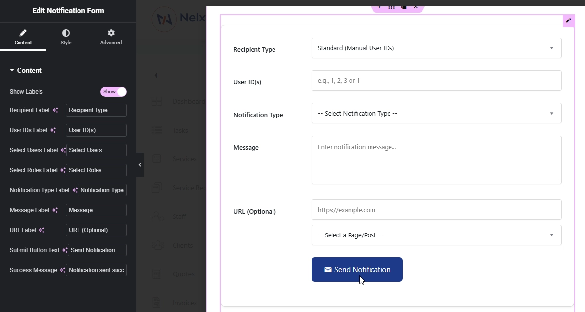
Notification Form Widget #
This is the frontend version of the admin notification form. It’s only visible to users with administrator permissions.
Features #
- Same functionality as the admin form
- Full recipient selection (manual IDs, user search, role selection)
- Notification type dropdown (auto-populated from CCT)
- Message field
- URL field with page/post selector
- Real-time validation
- Success/error messages
Security #
- Only accessible to logged-in users with
manage_optionscapability - Nonce verification on all requests
- Input sanitization and validation